Life Expectancy
Last Modified 27/02/2026 14:37:48
Share this page
Introduction
Life expectancy is one of the key indicators of health in a population. Life expectancy at birth is defined as the average number of years that a newborn is expected to live if current mortality rates continue to apply. Life expectancy for men in Blackpool is 73.7 years and for women is 79.1 years (2022-2024), both significantly lower than England. Not only do people in Blackpool live shorter lives, but they also spend a smaller proportion of their lifespan in good health and without disability (Figures 10 and 11).
Blackpool faces major health challenges. The early 2000s saw a steady improvement in life expectancy, dropping in 2013-15 before levelling off until 2017-19. However, the gap between Blackpool and the rest of England continues to grow (Figure 1 and 2). Life expectancy fell for both males and females from 2020 onwards, a trend also reflected nationally as the country was impacted by Covid-19. The coronavirus pandemic has led to increased mortality during 2020 and 2021.
Both men and women in Blackpool have the lowest life expectancy from birth of any local authority in England. Blackpool's male life expectancy is 5.8 years below England and 1.6 years below the North West. Female life expectancy is 4.2 years below England and 1.4 years below the North West (2022-24).
Figure 1 - Life Expectancy at Birth (1991-93 to 2022-24)
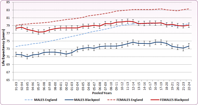
Source: Office for National Statistics (ONS), Life expectancy at birth (years)
Figure 2 - Life expectancy at birth table (2001-03 to 2021-23)
| | MALES | FEMALES |
|---|
| | England | North West | Blackpool | England | North West | Blackpool |
|---|
| 2001-03 |
76.2 |
74.8 |
72.0 |
80.7 |
79.5 |
78.4 |
|---|
| 2002-04 |
76.5 |
75.1 |
72.9 |
80.9 |
79.7 |
78.4 |
|---|
| 2003-05 |
76.9 |
75.4 |
73.2 |
81.1 |
79.9 |
78.8 |
|---|
| 2004-06 |
77.2 |
75.7 |
73.4 |
81.5 |
80.2 |
78.8 |
|---|
| 2005-07 |
77.5 |
76.0 |
73.2 |
81.7 |
80.4 |
79.1 |
|---|
| 2006-08 |
77.8 |
76.3 |
73.6 |
81.9 |
80.5 |
78.9 |
|---|
| 2007-09 |
78.1 |
76.6 |
73.7 |
82.1 |
80.7 |
79.5 |
|---|
| 2008-10 |
78.4 |
76.9 |
73.7 |
82.3 |
81.0 |
79.5 |
|---|
| 2009-11 |
78.8 |
77.3 |
73.7 |
82.7 |
81.4 |
79.9 |
|---|
| 2010-12 |
79.1 |
77.6 |
74.0 |
82.9 |
81.6 |
79.9 |
|---|
| 2011-13 |
79.3 |
77.9 |
74.3 |
83.0 |
81.7 |
80.1 |
|---|
| 2012-14 |
79.4 |
78.0 |
74.7 |
83.1 |
81.8 |
80.0 |
|---|
| 2013-15 |
79.4 |
78.1 |
74.4 |
83.1 |
81.8 |
79.5 |
|---|
| 2014-16 |
79.5 |
78.1 |
74.4 |
83.1 |
81.7 |
79.5 |
|---|
| 2015-17 |
79.5 |
78.2 |
74.4 |
83.1 |
81.7 |
79.6 |
|---|
| 2016-18 |
79.6 |
78.3 |
74.7 |
83.2 |
81.9 |
79.6 |
|---|
| 2017-19 |
79.7 |
78.4 |
74.7 |
83.3 |
82.0 |
79.7 |
|---|
| 2018-20 |
79.3 |
77.9 |
74.4 |
83.1 |
81.7 |
79.2 |
|---|
| 2019-21 |
79.0 |
77.5 |
73.7 |
82.9 |
81.5 |
79.3 |
|---|
| 2020-22 |
78.9 |
77.3 |
73.4 |
82.8 |
81.3 |
79.0 |
|---|
| 2021-23 |
79.1 |
77.5 |
73.1 |
83.1 |
81.6 |
78.9 |
|---|
| 2022-24 |
79.5 |
77.9 |
73.7 |
83.3 |
81.9 |
79.1 |
|---|
Source: Office for National Statistics, Life expectancy at birth (years)
Variation in Life Expectancy within Blackpool
There is geographical variation within Blackpool (Figures 3 and 4) with male life expectancy ranging from 68.4 years in Bloomfield, to 79.6 years in Marton - a difference of 11.2 years. Female life expectancy ranges from 72.9 years in Claremont to 82.7 years in Greenlands, a difference of 9.8 years.
Figure 3 - Male and Female Life Expectancy by Ward, Blackpool (2016 - 2020)
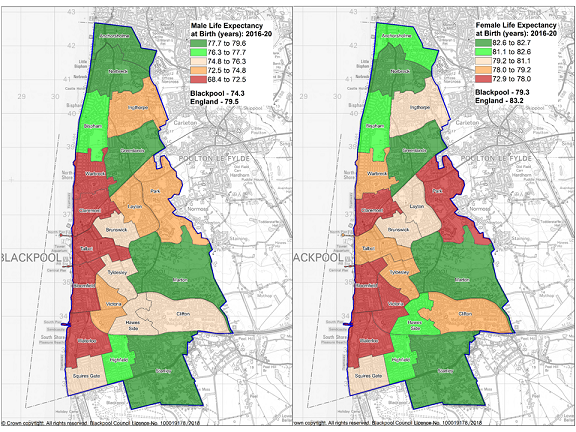 Source: OHID, Local Health
Whereas life expectancy (LE) is an estimate of how many years a person might be expected to live, healthy life expectancy (HLE) is an estimate of how many years they might live in 'good' health. The HLE estimate was calculated using self-reported prevalence of 'Good' general health collected in the Annual Population Survey. Comparisons of HLE between England and Blackpool show a greater difference than for LE alone.
-
- Blackpool has the lowest HLE for males and the third lowest for females of any upper tier local authority in England
- HLE in Blackpool males is just 50.9 years, 10 years lower than England as a whole, 60.9 years
- Female HLE is 51.8 years, over 9 years lower than the England average of 61.3 years
- People living in Blackpool live about a third of their lives in poor health. 31% for males and 35% for females
- This compares to 23% of males and 26% of females across England living in poor health
- HLE for men in Blackpool has reduced by 3 years from 54.7 years in 2017-19 (pre-pandemic) to 50.9 years in 2022-24
- For women the reduction is 3.5 years from 55.3 years to 51.8 years over the same period. In comparison HLE for males in England reduced by 2.3 years, females reduced by 2.3 years.
From this it can be observed that residents of Blackpool live shorter lives than the national average, and furthermore spend a smaller proportion of their shorter lifespan healthy and disability-free (Figures 4 and 5).
Figure 4 - Male Life expectancy and Healthy Life Expectancy, Upper Tier Local Authority (2022-24)
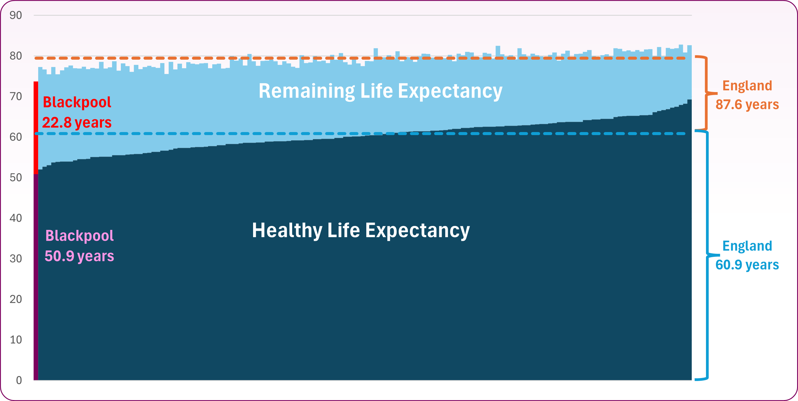
Source: ONS, Healthy Life Expectancy
Figure 5 - Female Life expectancy and Healthy Life Expectancy, Upper Tier Local Authority (2022-24)
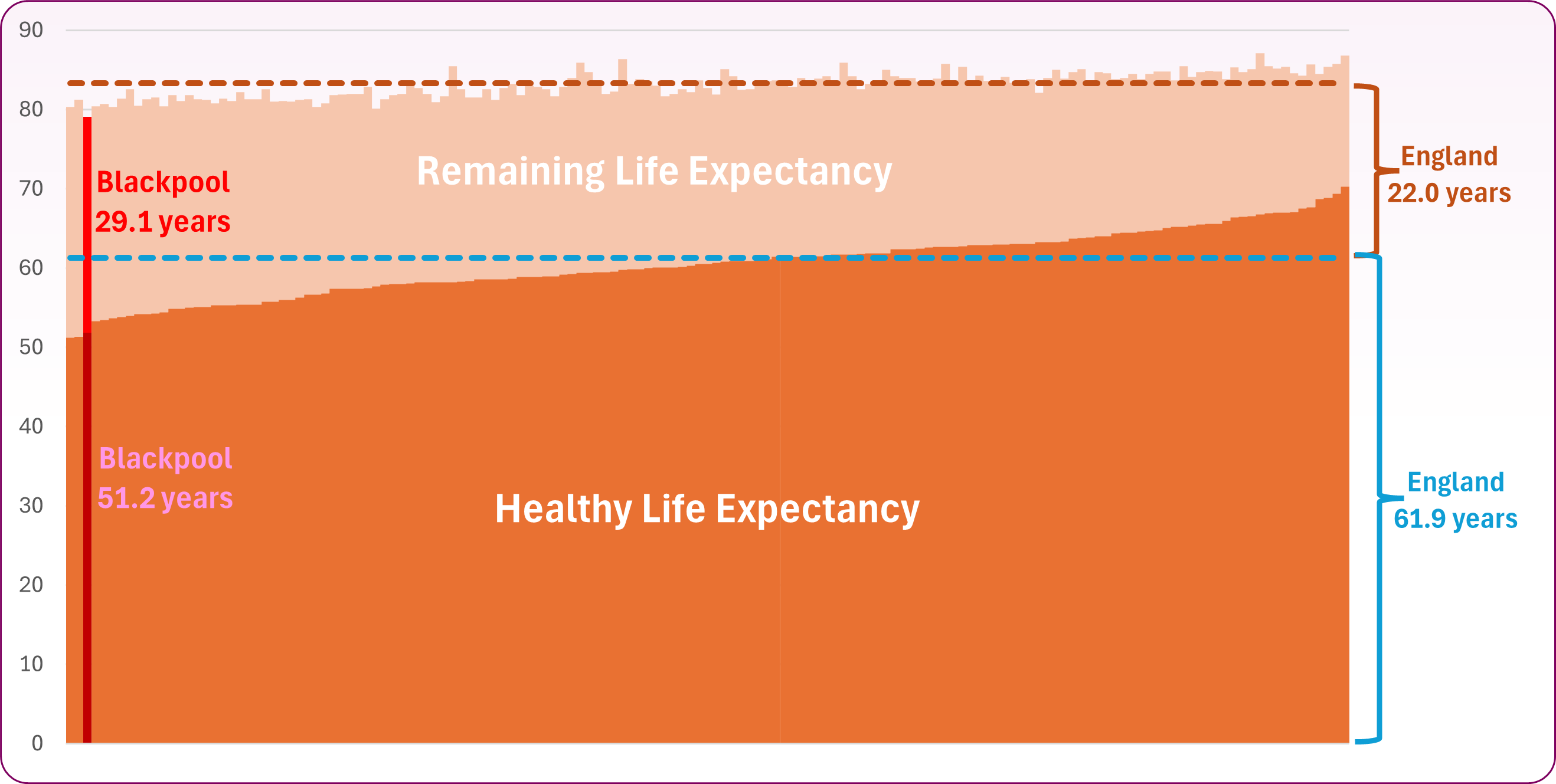 Source: ONS, Healthly Life Expectancy
Understanding variations in Life Expectancy
Figure 8 shows the causes of mortality that contribute to the life expectancy gap between the 20% most deprived communities in Blackpool and the 20% least deprived communities in Blackpool, by cause of death for the COVID-19 affected period 2021-23. Each death of a younger person, especially babies and children, contributes disproportionaly to the gap, as more years of life are lost. The largest difference in life expectancy between the most and least deprived communities for males is due to deaths from external causes, that is deaths from injuries, poisonings and suicide, which account for 24.8%. For females it is circulatory diseases (including coronary heart disease and stroke) (19.6%). This has changed since 2015-17 when the largest difference was respiratory diseases (including flu, pneumonia and chronic lower respiratoy disease) (21.7%) followed by circulatory diseases (21.6%) and cancer (16.3%).
Figure 8 - Scarf Chart showing the breakdown of the life expectancy gap between the most deprived quintile in Blackpool and the least deprived quintile in Blackpool, by cause of death, 2022-2023
Source: Office for Health Improvement and Disparities (OHID), Segment Tool
Figure 9 shows the breakdown of the life expectancy gap between Blackpool as a whole and England as a whole, by cause of death for the period 2022-2023.
For males, mortality from circulatory disease (20.6%), external causes (22.6%), and cancer (16.6%) are major contributors to the gap in life expectancy between Blackpool and England as a whole. For females, respiratory diseases (21.6%), cancer (16.2%), and circulatory diseases (8.2%) are the main contributors.
Figure 9 - Scarf Chart showing the breakdown of the life expectancy gap between Blackpool as a whole and England as a whole, by cause of death, 2022-2023

Source: Office for Health Improvement and Disparities (OHID), Segment Tool. Please note, these scarf charts are based on ONS death registration data and provisional mid-year population estimates for the relevant years, and Ministry of Housing, Communities and Local Government Index of Multiple Deprivation, 2019. There is no indication as to when the updated charts (using the 2025 IMD) will be published.
The Slope Index of Inequality in life expectancy is an indicator that measures health inequalities within a local area. The measure compares life expectancies between geographic sub-areas that have been ranked by socioeconomic deprivation. Figures 10 and 11 illustrate the change that has occurred over time in the Slope Index of Inequality in both males and females. Those in the most affluent communities within Blackpool saw similar life expectancy between 2010-12 and 2021-23, whilst those in less affluent areas, particularly women, were more likely to see a reduction. The steeper angle of the slope in 2021-23 shows that inequalities of life expectancy between the most and least deprived areas have increased. For further information regarding the Slope Index of Inequality please see:
Guide to the Slope Index of Inequality
Figure 10 - Blackpool - Life Expectancy at Birth by Deprivation Deciles - Males - Slope Analysis
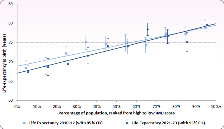
Source: OHID Public Health Profiles / ONS, Life expectancy at birth by deprivation decile, 2010-12 to 2021-23
Figure 11 - Blackpool - Life Expectancy at Birth by Deprivation Deciles - Females - Slope Analysis
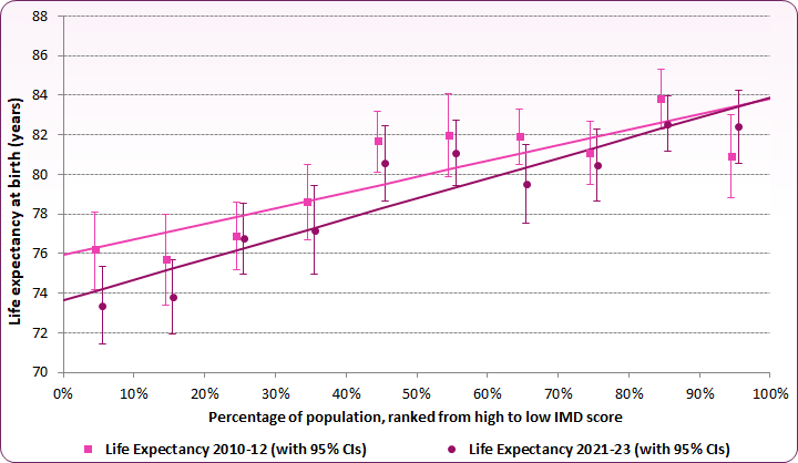
Source: OHID Public Health Profiles / ONS, Life expectancy at birth by deprivation decile, 2010-12 to 2021-23